Chart
Charts that analyze and visualize data are the main components of a dashboard. This section describes some concepts that you need to understand to create a chart for data analytics, as well as the elements that make up the chart configuration UI.
The chart home is divided into the following three sections:
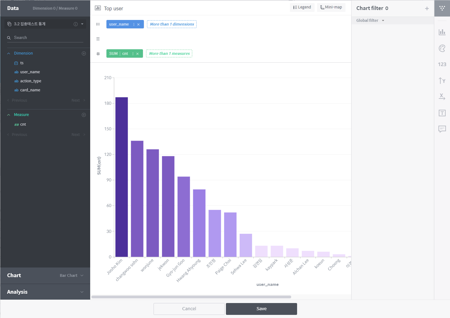
Column/chart selection section: This section is so organized that you can create a chart step by step. You can either choose columns under the Data menu to have appropriate chart types suggested, or select a chart type under the Chart menu before choosing data columns. In addition, you can configure some analytics settings under the Analytics menu.
Visualization section: This section is composed of the shelves onto which columns are put and the visualization area where the chart is displayed. Once data and a chart type are selected in the column/chart selection section, the chart is drawn in this area.
Option section: Used to customize the appearance and display of the chart. Depending on the chart type, the option section may include the filter, palette, axis, numeric format, and chart format areas.
In the subsequent subsections, we will explain how to use this user interface to create and manage various types of charts.